Thursday, 9 December 2010
Synopsis Edit
After going over the storyboard we have decided to change some bits of the synopsis as we have came up with better ideas for the short intro sequence. The overall brief of it is : A girl is going through a corridor slowly and all she has to light the room up is a lighter, while walking the lighter goes out and takes a few seconds to relight and continues through the corridor. She enters a room and see's some sort of creature in the corner. At this point we see the point of view of the creature and then from it's point of view it starts running up to the girl and goes into a chase scene. We do not see the creatures face of the girls face as this gives mystery and questioning to who is the girl and what is that thing chasing her. It goes into a dramatic chase scene where we still don't see the girls face or the creature and she there trying to use the lighter to see where she going and eventually she gets into a room and locks herself in where luckily there is a key in the door. You hear banging on the door as the creature tries getting in and the girl backs away from the door and slides herself against the back wall of the room. The camera slowly goes up her legs till it goes to the girls face where she is weeping and scared. Make up will be fake blood, smeared lipstick and basically the girl looks a mess. The girl screams and it ends with the title coming up the title of the film intro will be called 'alone in the dark' we are thinking of using some sort of fade in effect for the title as it gives more of a effect of the film and gives little ideas of what kind of film it is.
Shot list
These are the shots we are using in the feature film, in order.
Shot 1: Close up of lighter
Shot 2: Close up of lighter with door in background
Shot 3: Long shot of the door to the room
Shot 4: Close up of the light switch including a pan whip to the light
Shot 5: Long shot of the zombie in the corner of the room
Shot 6: Long shot of girls feet in the door way
Shot 7: Extreme close up of the girls eye
Shot 8: Close up of feet running away
Shot 9: Long Shot of the corridor with doors on either side
Shot 10: Close up of a door on the left side of the corridor
Shot 11: Long shot of the corridor with doors on either side again
Shot 12: Close up of hand turning door key
Shot 13: Midshot behind the girl with the pan going down her body, door visible infront.
Shot 14: Close up of the door banging, zombie on other side.
Shot 15: Close up of girls feet, camera panning up her body.
Shot 16: Close up of Lighter flicking
Shot 17: Jump shot of lighter flicking
Shot 18: Close of lighter flicking this time door is in sight.
Shot 19: Close up of a clock on the wall, it's midnight
Shot 20: Close up of girl's ragged face
Shot 21: Titles
Locations
Dan has rang a friend today and asked for any possible locations that we could use for our title sequence. He had a suggestion of a old mansion down the road from the college that would be a ideal place to film but the place is locked up and would require to get in contact with the owners to be able to film. He will inform me on any other locations and will ask around for me and my group.
Monday, 6 December 2010
Synopsis
This is a brief explanation of what will happen in our opening sequence: A girl (of target audience age) she hears a bang and walks into the room, flicks the light on and sees a huddled figure in the corner. The light turns off and she runs away, she can hear the figure advancing towards her. The she runs down the corridor, she stops, you can hear her heavy breathing, she flicks a lighter on infront of her face, you can see the figure behind her. The lighter flicks off, she yelps and then you hear a growl and a thud (her falling on the floor) then like an eating noise and then the lights come on and you can see her dead body, the titles appear across her body, music plays 'let it shine'. The titles will appear in some sections where light is shone.
Thursday, 2 December 2010
Genre Research Summary
Our research has had an impact of our work as we will shape it into what our audiences want from a Horror.
 For our titles we would have red text on a black background, typical horror titles. The titles will float slowly across the screen and fade in and out of transition to give this eerie idea, this is quite typical of a horror which is what our audience want.
Because are audience want typical horror qualities we woul have deep, slow music playing like a piano. Screaming noises are also typically associated with horror so we will put some non-diegetic screaming noises in.
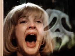
The characters we see in the opening sequence would be the heroine, portrayed as innocent, through costume, eg a white dress and a close up of her 'innocent' face because the horror genre always has an innocent character.
The lighting would be normal, everyday lighting to give the audience an idea that it is a real life scene, with bright rooms. For example a street in the opening titles would be like a street in real life.
Ellipsis, we don't know what happened to the character and enigma codes.
The editing would be fast in the chase scenes and fast music would play when a character is scared. Close ups of face and slow zooms to make the audience focus on what is going on.
Because are audience want typical horror qualities we woul have deep, slow music playing like a piano. Screaming noises are also typically associated with horror so we will put some non-diegetic screaming noises in.
The characters we see in the opening sequence would be the heroine, portrayed as innocent, through costume, eg a white dress and a close up of her 'innocent' face because the horror genre always has an innocent character.
The lighting would be normal, everyday lighting to give the audience an idea that it is a real life scene, with bright rooms. For example a street in the opening titles would be like a street in real life.
Ellipsis, we don't know what happened to the character and enigma codes.
The editing would be fast in the chase scenes and fast music would play when a character is scared. Close ups of face and slow zooms to make the audience focus on what is going on.
Wednesday, 1 December 2010
Target Audience Research
We've done some research to help what qualities of horror movies people enjoy. We chosen four people, two boys and two girls, who are all 16. Two of these people are mainstreamers and the other two are individualists. We chose two different audiences to get an feel for their contrasting likes, or if they are similar.
We asked the four people this question on Facebook:
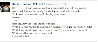
We received these responses:

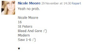
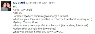
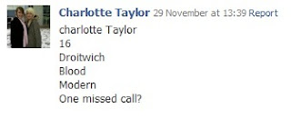
We asked the four people this question on Facebook:

We received these responses:


Monday, 29 November 2010
Target Audience
We need to appeal to our Demographic and Pyschographic audience.
Demographic is the audiences social status determined by their career. For example, Manual Worker or Managerial role. They are all set in different 'social grades'.
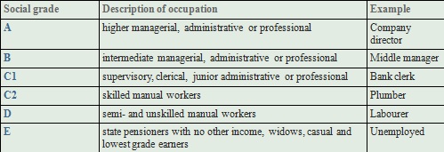
We decided that C1, C2 and D were going to be our demographic audience as it is a low budget opening sequence so it would be easier to appeal to the lower social grades.
The psychographic side of the audience is a way of targeting needs, desires and aspirations of the person.Some psychographic groups are:
Demographic is the audiences social status determined by their career. For example, Manual Worker or Managerial role. They are all set in different 'social grades'.

We decided that C1, C2 and D were going to be our demographic audience as it is a low budget opening sequence so it would be easier to appeal to the lower social grades.
The psychographic side of the audience is a way of targeting needs, desires and aspirations of the person.Some psychographic groups are:
· Mainstreamers: people who don’t like to be different but are conventional in their tastes and aspirations
· Traditionalists: people who don’t like change and are very set in their ways
· Hedonists: people who just want to have a good time
Individualists: people who want to stand out from the crowd and like to think for themselves
· Rebels: people who don’t want to conform but challenge the traditional way of doing things.
We are trying to appeal to Mainstreamers so we will use expected themes and narrations.
We are trying to appeal to Mainstreamers so we will use expected themes and narrations.
Film Openings - Genre Specific Analysis
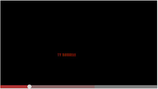 The opening sequence from 'Dawn of the Dead' illustrate the genre of the film through the use of cinematography, editing and Mise-en-scene.
 Here the black background gives the audience a sense of isolation from the world. The red text of the titles on the black background is associated with blood and gore and evil which tells the audience it's a horror.
Genre Moodboard
This is our Horror mood board. As you can see it has iconic horror characters such as clowns, zombies and masked men. The purpose of the mood board was to give a general idea of the genre and to get the creativity going.
First Ideas
Me, Dan and Zoe want to work in a horror. We will ask around e,g Facebook groups what genres people like. The target audience would be teenagers who like Horrors after asking around. The horror we make, will be set in modern day time and we want to use Tzvetan Todorov’s stage theory.
Tuesday, 23 November 2010
Dexter: Concept to Screen


Straight away I noticed that the title 'Dexter' had upside down letters in it but was still distinguishable. This gives this idea that Dexter is about understanding the deeper, darker meanings of things that appear normal on the surface of every day life. For example the letters were upside down, which looks normal at a first glance but when you look closely at the title it reveals this kind of upside down, messed up idea of Dexter because the letters are upside down giving this idea that his thoughts are upside down and that not everything in Dexter's world is how it appears to be like on the surface, but instead it is dark and mysterious. Also the text is white with this worn out look. It tells me that Dexter could possibly be linked to science because it reminds me of the white lab coats, but because the letters are worn out, it gives the idea of corruption of Dexter's mind or profession.
The opening sequence shows close ups of every day morning routines. Because they are taken close up it gives them this sinister and mysterious effect. For example the close up of the shave. His hair is shown as rough and unfriendly because it sticks out at such awkward distorted angles. Again, this gives this idea of innocence on the surface of real life (he's shaving) but close up and underneath it's sinister and dangerous and linked to evil.
Wednesday, 17 November 2010
Research: Key Conventions
One of the main points of the opening sequences is to introduce the genres, the cast and the crew, the key conventions and crucial information. We looked at the opening sequences of Kickass, Shifty, In Search of a Midnight Kiss, London to Brighton, Brick and Juno.
 For example Roland Barthe's Enigma code is used in Brick to make the audience ask questions to draw them in further by using this omniscient narration, it makes the viewers ask why is there a body on the floor? And through this we understand that Brick is dark and noir fillm.
 Exposition is used during the opening sequence of Kick Ass in the form of a voice over to give the viewers an idea of the main characters life, we understand that he a lonely teenager with an uneventful life, he lives with his dad, goes to school ect. Also ellipsis is used in the exposition, six months earlier, which gives the viewers an idea that it could be a flash back. This contrasts with this idea of a super hero sky which gives the idea that the film will be about action. Linking to Levi Strauss's Binary Opposites; Super Hero v Normal Human. Tzvetan Todorov’s stage theory is also used but starts at the second stage; the problem is that he isn't popular and he is normal so he looks for a solution so he can become popular.
We have also learnt that we understand who the dominant characters are through the amount of screen time they have. For example in Shifty one guy has the majority of the screen time so we empathise with him the most and we want to like him and understand more about him.

Main Task
Our Main Task is to create the opening titles of a new fictional film to last two minutes.
Our dead lines are:
Our dead lines are:
Research Deadline: 26/11/10
Photo-storyboard Deadline: 3/12/10
Filming Deadline: 07/01/11
Production Deadline: 28/01/11
Evaluation Deadline: 11/02/11
Monday, 18 October 2010
Targets
My targets are:-
- Have better time keeping; I should plan out how long I will spend on each shot using the camera.
- Learn to use Adobe Premiere more efficiently.
- Communicate better in a team
- Use more resources available to me.
Friday, 15 October 2010
Evaluation
Continuity editing is a style of editing used by Hollywood film makers to make films appear seamless in their final form to encourage the audience to engage further into a film. The main rules of Continuity editing are 180 degree rule, match on action and eye line match.
I personally found the SLR camera easy to use on the basic level that we needed to use it on. We used functions on the camera such as zoom and playback. After we had finished taking shots we uploaded them onto a computer using the Micro SD Card that was inside the camera while taking the shots.
Organising the film was simple in my opinion because it was not long enough to require alot of arrangements. To be better organised I could of made a plan before hand of the order we would record the shots.
It was my first time using a digital camera. I learnt about the play back function and the zoom. I also learnt you need to give the camera about three seconds after you press the record button to start filming properly as it may cut some of the recording short. To upload the videos onto a computer I had to use a firewire cable open up Adobe Onlocation and playback the video using the playback tool on the camera to make a copy on the computer.
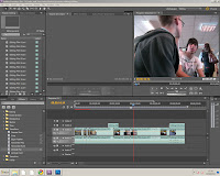 Now that we had the recordings we had to edit them into something viewable with all the continuity edits used. I found Premiere hard to use at first and then I slowly learnt how to use it when I gained experience. At one part we had to remove the video and keep the sound of a shot so we could use another video to make the whole thing run more smoothly. We used vertical flip to make the corridor shot run more smoothly.
We then uploaded our video onto YouTube by making an account and from there it was pretty simple to upload but took a few minutes. To put it onto my blog I had to go onto the Edit HTML tab and paste the Embed code of the YouTube video onto it.
I enjoyed using Blogger because it is a fun alternative to writing essays on paper or Word. I liked the fact I could insert pictures and move them about.
Post-Production
Firstly uploading the video was time consuming as the program kept crashing and the battery of the camera continued to run out of power. Secondly, I found the editing program tedious to start with because there were so many new controls I did not know about.
Editing the match of action shot was definitely the hardest edit to do as you have to make it appear seamless to the viewer. The shot where the person walks down the corridor and comes out the other side of the door were recorded on two different angles so I had to use a vertical flip on the corridor shot. Also shots were sometimes cut short due to the tape recording so I had to work with what we had and make them flow as continuous as I could make it.
Editing the match of action shot was definitely the hardest edit to do as you have to make it appear seamless to the viewer. The shot where the person walks down the corridor and comes out the other side of the door were recorded on two different angles so I had to use a vertical flip on the corridor shot. Also shots were sometimes cut short due to the tape recording so I had to work with what we had and make them flow as continuous as I could make it.
Production
I enjoyed filming but I found parts of it frustrating. For example one problem was that the battery of the hand held camera ran out of power repeatedly, we had to change the battery three times. Also while filming areas where we were recording could get busy and people who make a noise or walk infront of the camera which holds us up. I enjoyed taking it in turns to record and be infront of the camera as I learnt quite alot on how to handle the camera. I also enjoyed putting my knowledge to the test and using the different shot types.
Monday, 11 October 2010
Pre-Production Task
Before we started filming we had to do various tasks. For example we had to do a risk assessment. The risk assessment involved identifying possible dangers while recording. For example a risk could be somebody tripping over a tripod, we had to assess the chances of that happening. We then had to assess the fatality of the risk, for example could you die from tripping over a tripod? Another task we had to complete was the process of making a story board. The story board used relevant images, eg the corridor I would walk down, that were photographed by me and my group to explain the process of filming. Before we started filming we had to create a script and choose a third person to cast in the production.
Monday, 27 September 2010
Continuity Editing
Continuity Editing is a style of film editing mostly used by Hollywood film editors. The purpose of Continuity editing is to make the editing invisible so the is viewer unaware of the fact they are watching a TV programme or Film so they can further immerse themselves within the situation because it seems more realistic. The viewer does not notice the cuts so it flows naturally and continuous.
Preliminary Task – Video Production
The task involves a character opening a door and crossing the room. The character will then sit down opposite another character who will engage in conversation with. Match on action, shot reverse shots and the 180 degree rule.
Also, a cut in and a cut away must be used and they must flow correctly with relevant conversation taking place.
Also, a cut in and a cut away must be used and they must flow correctly with relevant conversation taking place.
Thursday, 23 September 2010
Welcome
Hai
Welcome to my AS Media Studies blog.
This blog will be updated with my preliminary and main task progress.
Welcome to my AS Media Studies blog.
This blog will be updated with my preliminary and main task progress.
Subscribe to:
Comments (Atom)


